How Better Brand Testing Can Break the Shackles Holding Back Your Business
Cracker Barrel’s failure to understand the hidden costs of poor design was a recipe for disaster — don’t follow their example
By Lon Shapiro (originally published on Medium, August 28, 20125)
Unlike Donald Rumsfeld, Psychologists David Dunning and Justin Kruger won a Nobel Prize for their work on unknown unknowns.
In 2002, Rumsfeld turned the principle of innocent until proven guilty on its head when he said that “the absence of evidence does not mean the evidence is absent.” In response to a report that there was no evidence linking the government of Iraq with the supply of weapons of mass destruction (WMDs) to terrorist groups Rumsfeld said the following:
“Reports that say that something hasn’t happened are always interesting to me, because as we know, there are known knowns; there are things we know we know. We also know there are known unknowns; that is to say we know there are some things we do not know. But there are also unknown unknowns — the ones we don’t know we don’t know. And if one looks throughout the history of our country and other free countries, it is the latter category that tends to be the difficult ones.”
He used the idea of unknown unknowns to justify an illegal invasion of Iraq, telling the public with absolute certainty that, “we know where they [WMDs] are. They’re in the area around Tikrit and Baghdad…”
But it was all a big lie as not one shred of evidence was found that weapons, factories, or raw materials ever existed in Iraq after the 1991 Gulf War.
On the other hand, Dunning and Kruger examined unknown unknowns from a psychological perspective. They found that people who failed a sample physics test were just as confident about their scores as the highly trained students who knew every answer.
That is the essence of the Dunning-Kruger effect, or as David Dunning wrote, “We Are All Confident Idiots.”
An even more insidious side effect of the Dunning-Kruger effect is that successful people don’t think it applies to them.
That’s how we get CEOs and politicians saying idiotic things about fields where they are ignorant without having done a second of research, or finding a shred of evidence.
Now you know the reason why products like the Edsel, New Coke, yogurt shampoo, Harley-Davison perfume, and anything carrying the Donald Trump brand end up looking like this.
In the world of design, we have a number of Hindenberg-like implosions.
Most recently, Cracker Barrel decided to modernize their logo.
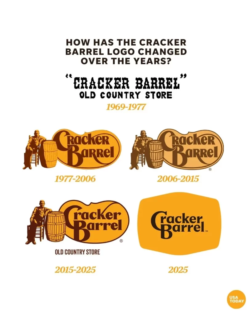
After intense public backlash, Cracker Barrel reversed course and scrapped the logo with a minimum of damage. Maybe it had something to do with the fact they lost one-hundred million dollars in market value on Wall Street the day of the announcement.
But Cracker Barrel got off easy. With the magic (and horrors) of social media, they got instant feedback and decided it was a bad idea.
The true Hindenberg of design was the infamous Tropicana Orange Juice rebranding disaster.
Pepsi hired Peter Arnell, who had successfully modernized their brand in 2008. But if you read his pretentious Pepsi brand manual, you will see a man in love with himself and his ideas to the most absurd extreme.
Here is what the same guy did to the iconic Tropicana Orange Juice brand.

The straw in the orange graphic is the best icon for freshness you could possibly design, and they replaced it with something that looks like the generic private label branding of a supermarket operating in the 1970s.
Arnell charged millions of dollars for his rebranding work, which just goes to show if you put together a good enough dog-and-pony show, you can get rich off the suckers of the world.
By now, you must be wondering, “But what does all this have to do with the hidden costs of poor design?
The answer is, you can’t understand the hidden costs of poor design until you’ve seen the real costs associated with branding disasters.
As a business owner, you might think that you avoided a similar catastrophe, but what you have not considered are the opportunity costs that might come from great new packaging. All because you didn’t look for a qualified professional graphic designer or ad agency and explore the possibilities.
In the online era, nobody thinks about print anymore.
Companies used to pay thousands of dollars to design and print brochures. My firm once did a 150-page technical spec binder for Dunn-Edwards Paints, complete with color coded dividers and key art created from a photo shoot. To supply all their distributors, they spent $300,000 to print all the notebooks and booklets. That job was so huge, my printer treated me like a big shot. He gave me courtside seats to a Lakers game once — the only time I could ever afford to go to a game in person.
But there is one place where printing matters — the world of packaging.
“Package design is the single most sales-effective and cost-efficient marketing tool.” — Rob Wallace
Design Management Institute did a study to show the return on investment (ROI)of packaging design. I keep a pdf copy on my website. Check it out.
In his study, Wallace found that the ROI on package design far exceeded the returns from advertising and marketing.
Why is this?
- No matter how much you spend on media buys, not everyone will see your ads, or social media posts.
- Of the ones who see your ads, how many will even pay attention? We have entire generations who have turned off traditional TV and radio, preferring to stream content with a minimum of ads.
- When someone is walking around in a store they decision to buy something. When they get to a section they want, they see a small group of products and the only thing speaking to them is each front label.
- If someone picks up your product, everything — brand strategy, company vision, design and development — should be clearly expressed on the package. And you’ve only got 5 to 50 seconds for them to make a purchasing decision.
Given all this information, why do business owners consistently ignore the value of great package design?
The first part of the problem is that traditional companies believe in the outdated concept, “If you can’t measure it, you can’t manage it.”
In the consumer packaged goods (CPG) sector, packaging should be the cornerstone upon which you build your entire brand strategy, not an afterthought.
The second part of the problem is that companies don’t like to spend money. But is it rational to cut every corner when packaging design costs represent a tiny fraction of a company’s sales and marketing budget? That’s why Wallace’s paper on packaging ROI is so important.
The third part of the problem is that CEOs and upper management are successful people and they fall victim to the Dunning-Kruger effect just as much as the average man or woman on the street. How many times do companies make packaging or advertising decisions based on the personal taste of the owner? I’ve seen it far too many times to count.
But unless the business owner is part of the company’s target market demographic, why on earth should personal preferences ever enter the conversation?
When our firm gets a new client, we pay attention to their products and target market. If I’m not part of their target demographic, we start out by getting opinions of family and friends within that demographic. In some cases, we hire a professional who is part of that demographic to make sure we add as many different perspectives and ideas to the mix as possible.
Once we have a presentation of concepts ready, we show the client and discuss the possibility of doing focus groups with the client. We also call on store buyers we know or the client knows to get their opinion on new package design ideas. We do this to make sure they don’t go down in flames, like another Hindenberg.
When choosing the right design firm, you don’t need to reinvent the wheel — just make sure they aren’t selling square ones because the corners look so cool.
Don’t design firms that make subjective design choices. Firms that lean on personal preferences, popular trends, or a designer’s creative prowess are just as useless as a client who says, “I don’t know what I want, but I’ll let you know when I see it.”
Look for a company’s track record within your industry category. If they have done work for similar companies, they have probably done the market research to understand your needs.
Instead of hiring a designer from another country, look for a firm that approaches design like an ad agency. They should be able to write a creative brief that spells out the message you want to communicate to your target market.
After you review and approve the brief, you should work with the firm to decide on a creative strategy. Only after you have signed off on a creative strategy should any work begin on creative concepts. This is the road map that guides a design firm to know if it has succeeded to deliver your message. It is also insures that a fickle client can’t change their mind at the last second to change that message and demand a whole new creative process.
Here’s a little case study to illustrate our process.
With years of experience doing packaging and label design for the food industry, we began working with a company that imports a wide range of canned goods, including a whole line of seafood, fruit, vegetables, oils, and spices.
Their old label designs were all over the place, as they hired designers in different countries with different skill sets in order to save money. But they realized that the time lost going back and forth on revisions, along with navigating language barriers created a different set of costs.
As the company’s focus shifted more from acting as a wholesaler to becoming a retailer, they needed our help.
Here are the main issues confronting their retail efforts:
- The main logo was altered over time, so there was no consistent branding image.
- Many of the seafood products were not visually attractive.
- The labels featured background illustrations of the sea but they looked dirty because of the way the art was created.
- The suggested serving photography was flat, poorly lit, and outdated.
Here is how we resolved these problems:
- Because the client had a large Hispanic market that recognized the brand, we wanted to make it even easier to pick out the brand from a crowded supermarket shelf. We eventually solved the problem by following the example of Starbucks. We updated the main logo and changed the proportions so that its central icon could be larger and centered. This was especially important on small labels, where a big icon could sit next to the product name instead of getting squashed into a tiny space along the top.
- After researching competitors, we noticed that many brands did not show photos of the unattractive products. Instead, they might show photos of the ingredients that flavor the oil the product was packed in. Or they used playful illustrations to show the product. For products with especially small labels, we created stylized black and white illustrations of the fish and tinted them back to give the background color some depth and interest.
- We turned the background illustrations into bit map files. That way, we could easily change the color and transparency and increase the speed with which we created creative concepts. By the end of the process, the client decided that the illustrations were unnecessary, in large part, because they couldn’t be used on the smaller lablels.
- For products that had decent recipe shots, we used stock photos to compose better hero product shots spread out along the bottom of the label. In this way, we could increase the size and appetite appeal of the viewable part of the front label.
Because of the lack of original brand planning, the wide variety of products, the unattractiveness of some products, the process took much longer than most clients. In addition, there was a lack of clear direction from the top, because our client was second in command. After going through all the brainstorming and comping, he still had to get a sign off from the big boss. You can imagine how weeks of work might be wasted if the person at the top didn’t like the proposed concepts without giving us any feedback as to why.
Depending on a company’s size, brand testing can take different forms, but they are still the crucial final step.
After the boss approved the new designs it was time to test. While our client didn’t have the time or budget to do consumer surveys and focus groups, we had a pretty good indicator if the new branding would build on existing awareness, and excite new customers.
The way our client did this was to show the new branding designs to their buyers at the stores. In addition, my partner came from a huge ad agency and developed relationships with buyers from upscale chains like Bristol Farms.
Buyers are the people know what sells on their shelves but they also act as the gatekeepers who determine which products will ever be seen by consumers in the real world.
The hidden costs of poor design need to be measured as opportunity costs — the money you don’t make when the door stays closed.
Large companies may only see the cost of bad packaging in the form of marketing nightmares, like Cracker Barrel and Tropicana Orange Juice.
But for smaller companies, getting past the hurdle of store buyers is the difference between life and death for their products. Retail presence is a huge source of potential revenue.
And despite the rise of online sales, looks can be deceiving. One of our clients was an organic coffee company. He told us that their Amazon store did huge volume, but the required low prices meant that they were barely breaking even. All it did was keep their employees paid to roast the coffee beans.
We are extremely proud of our record of helping smaller brands and startups get into warehouse stores like Costco and Walmart, as well as winning prized shelf space in the supermarkets.
There is no greater accolade than hearing a buyer say, “that’s a great f*king package. I want that in my store!”
We don’t measure success by how many design awards we win. Our trophies are the feedback we get from clients when they tell us the buyers attending an industry convention clamored to order a product, or opened up doors to new markets in other countries. (See what we did for Sunkist Growers on our website.)
My concept art from 2001 Monsters Inc. outdoor agency competition and Photo by Kaur Martin on Unsplash