How to Think Different: A New Prespective on Creativity
Practical lessons from movie posters you can apply to writing.
By Lon Shapiro (originally published on Medium, September 14, 2019)
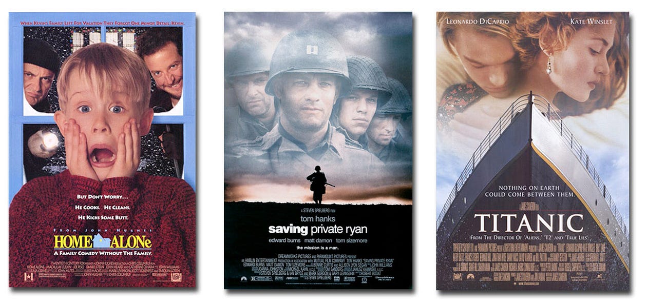
Look at the posters above and tell me what you see.
Is there something that connects them, or is this just a jumble of images?
Over 20 years ago, I started working for an award-winning designer who did all the A-list video covers for Disney, 20th Century Fox, Universal Home Video, and DreamWorks.
During the five years I worked there, I learned everything I know about design.
One of the funnier lessons happened one day as my boss was working out the cover art for a big video release. And he used the same principles used for posters.
It turned out to be the first of many eye-opening realizations I’ve had in my journey through the design world.
But before I open your eyes, I need you to close them.
CREATIVE EXERCISE #1: Squint your eyes as tight as you can, so you the type is just a grey blur. Now, look at the images above a second time.
If you saw something different, you’re learning to see like an artist.
There are tons of concepts that I could talk to you about — white, or negative space, color theory, typography, layout, layering, focus, etc. — but those are part of the artist’s province.
The goal of this article is to give you a new perspective on the nature of creativity.
Most people view creativity as something that randomly pops into our head or a state of mind that requires generous amounts of alcohol.
Or it is a muse we have to chase down before the idea gets away.
Here’s a quote from someone who has studied creativity as a science.
“Creativity involves breaking out of established patterns in order to look at things in a different way.“
— Edward de Bono
In his book “Serious Creativity,” de Bono developed exercises that force us to think in unusual ways.
He presents a road map to turn our minds into idea machines.
For people like me, whose career is based on the constant need to develop new ideas, this is a welcome new tool.
For those of you suffering from writer’s block, his approach to creativity may unlock the chains that bind you and become your magic carpet.
Now, let’s go back to movie posters story.
If you want to be more creative, sometimes you need a big head.
And sometimes a smaller one will do.
At the studio, my boss was drawing loose sketches on paper that already contained a roughly drawn rectangle the size of a VHS package cover.
He started talking about “big heads,” “medium heads,” and “little heads.”
At first, I had no idea what he meant. Then I figured out that this was his shorthand approach to finding a disciplined way of being creative.
If this still makes no sense, I’ve compiled a selection of famous movie posters to illustrate the terms.
BIG HEADS
Big heads are all about star power.
With the best designs, there are subtle graphic elements that help tell the story, but you don’t need to know a thing about the movie except who is the star.

MEDIUM HEADS
This approach is necessary when there is more than one star, and also creates more of an environment that tells the story of the film.
Look at the complexity in these samples.
Think back to Black Panther and the complexity of that poster: the design divides visual dominance between the ensemble cast and the technology of Wakanda, and all that country represents to moviegoers everywhere.

LITTLE HEADS
This approach is all about environment and mood, with almost no emphasis on the actors, even when you have a superstar like Brad Pitt in World War Z.
Every poster portrays a scene in the movie.

NO HEAD
Finally, I have added another category, “No head.”
This concept applies to movies where the studio created an iconic graphic treatment.

The difference between professionals and amateurs is not always quality; it’s the speed at which they can generate unique, high-quality concepts.
Sometimes, my boss reviewed the portfolio of a new graduate from his alma mater.
Some of the work was pretty good, but there was one huge difference between those young designers and our agency. A student could design a nice CD package over a semester, while we could design, execute and produce a commercial-level package in a day.
Our understanding of the creative process and the use of big-medium-little head thinking allowed us to create several unique looks for our client at lightning speed.
A new grad’s idea of different concepts was to take the same design and change around the color and font.
When I started an agency with Tom Guttman, I applied that same approach of categorizing comps by idea type.
During the creative or brainstorming phase, our goal as an agency was to provide 3–6 concepts that have a unique approach.
We wanted to throw out as many new and different concepts as possible.
And a key way to do that was to recognize if we were only doing a variation of another concept that had already been put up on our whiteboard.
At that point, I would ask my partner to choose which of the similar concepts was stronger, because there was no point in showing a client a weaker concept, regardless of how much one of us might have liked it personally.
By understanding the overarching idea behind a concept (big head, medium head, little head, no head), we didn’t waste time doing variations of the same thing.
If a client likes something, we can always refine it or add some elements from another comp that they like.
We have given the client a road map of general approaches to solving a specific problem, explained the reasoning behind each direction, and how it should affect the target audience.
In this way, clients don’t fly down one path blindly and then suddenly decide they need to go down another because it doesn’t work with their sales strategy.
How does this help writers improve their creativity?
The answer is it shows you a way of looking for the ideas behind ideas.
If we strip away genre, perspective, and characters, all that’s left is the theme.
Consider the possibilities if you are writing a series of novels using the same protagonist, but did a complete 180 on the theme, such as a Rambo movie about the nature of religious faith.
DeBono suggests methods to jump-start creativity by creating unstable combinations of ideas. We do this because the process may lead us to a jump point for an idea that can work.
He created the term “po,” which stands for a provocation operation.
Provocation forces people to think in different ways.
Here’s an example of a writer’s version of a de Bono exercise.
CREATIVE EXERCISE #2: Open yourself up to new combinations.
Make a stack of three cards, describing different choices for each category of thought.
For genre, you could have comedy, romance, thriller, horror, non-fiction, mystery, etc.
Then do the same thing for perspective and character.
Now, shuffle each deck separately, and then pick one card from each category.
You should come up with strange combinations you would never use.
The goal is to spend a pre-determined amount of time to see how to make the “po” work. Even if you don’t develop an actionable idea, you are working out your creative muscles.
After you do the exercise above, you should see the value of being open to new combinations of different types of ideas.
Here are three great posters that blurred the lines between the standard approaches to create something memorable:

In Home Alone, they start with a big head but create a complete environment in the background (poster border as a window, winter scene, comic burglars).
In Saving Private Ryan, notice how the medium heads (Tom Hanks is the star, but it was a strong ensemble cast that made the story so powerful) are ghosted back in the sky above the stark silhouette of a solitary soldier — a perfect parallel to the story of men who made the ultimate sacrifice to help one young man return to his family.
And, of course, Titanic is a love story about a man, a woman, and a boat.
Creative Exercise #3: Visualize Multiple Applications.
Bring creative thinking to the next level by planning out the back story and considering final applications.
In the days when print dominated the world, graphic designers had to think on multiple levels when designing a logo.
How it would the design work in full color, black and white, or using spot colors?
How would the design work if reduced in size, sent by fax, or reproduced as an ad slick?
In writing, attention to detail comes from creating the most realistic world you can create for your story.
The more concrete the details are in this world, the better the final product.
Michael Connelly is one of my favorite detective writers.
He created protagonist Hieronymous Bosch in such exquisite detail for his first novel that it’s clear he wrote volume one of a trilogy.
Creative Exercise #4: The Butterfly Effect
When you’ve got your back story and the environment in place, your characters start to tell you what they should be doing.
What would happen if you decided to make a fundamental change in the character’s back story?
Take a stack of cards that contain the backstories of your major characters.
Draw four or five events from the stack and try to imagine how one character’s motivation might change.
How would those decisions have led them on a completely different journey?
How would the perspective of your story change? Even the genre?
Just trying this thought experiment with one character would probably blow up your story.
The point of this exercise is not to improve a particular story but to radically change the way you think about ideas.
The End is Near.
Since I’ve been using posters as a way of explaining how to improve creativity, I want to close with three of my all-time favorites.
The Silence of the Lambs

This striking poster transcends “big head” on so many levels. It is one of the most disturbing posters in movie history without showing violent images. No giant skulls, bloody knives, fire, explosions, monsters, zombies, just a bug on a face.
The high contrast white face blends into white nothingness and pops out from the dark blurry background underneath. The only strong contrasting color is the reddish orange of the pupils, the moth and the movie title.
Now look at the details of the creepy death’s head moth covering Jodie Foster’s mouth. Within the moth is a skull created by naked women.
All of these color choices and image details tie into the mood and the story.
Chinatown

In this poster, we see medium heads, with Nicholson and Dunaway as the co-leads.
We see Nicholson as a film noir detective with a cigarette in his mouth that creates a cloud of smoke, but the smoke also creates a ghostly image of a woman’s hair.
Dunaway’s face is floating in the negative space in the background.
Finally, there is a hint of crashing waves which foreshadow the real mystery behind the story.
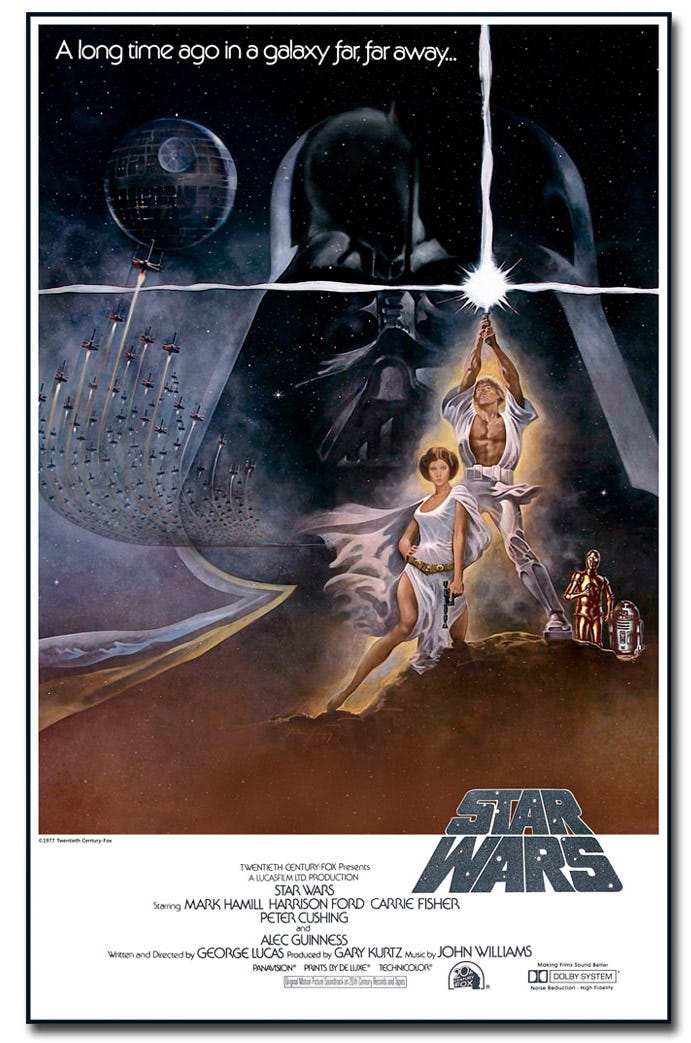
Star Wars

This may be my all-time favorite movie poster.
The artwork contains a richness and complexity that designers can only dream of approaching.
Is it a big head or little head?
There is a conflict of seemingly opposing elements, but somehow they are integrated and unified like a single force.
Wait, does that sound familiar?
We see most of the main characters, along with the death star and a massive squadron of space ships, but look who is looming in the background.
Darth Vader is not only evil, but he is the entire environment.
The bottom of his helmet and the outline of his cape turn into the brown ground of Tatooine.
The top of his helmet disappears and merges with space itself. He is both darkness and the foundation upon which Luke and Leia are standing.
Next, look at our heroes.
They’re dressed in white and have a halo of light around them. Luke is holding up a light saber, and for some reason (39 years before Kylo Ren’s funky sword), there is a power surge also going horizontally.
If we add the downward position of Leia’s pistol hand, it sure looks like a crucifix.
So now we’ve got the symbol of redemption and resurrection, with the intersection of the cross looking like a burst from Darth Vader’s eye.
There’s a reason Star Wars became such a huge cultural phenomenon, and the visual details in the poster reflect the most fundamental themes of humanity.
At the end, go back to the beginning.
Look at the first six posters one more time.
I’ll bet you will instantly figure out the category for each one.
If you want to continue to sharpen your feel for seeing things differently, watch a lot of comedies.
Better yet, go to a comedy club and think about how jokes work.
They create an environment, lead the listener toward an obvious conclusion and then surprise us with a completely different, but equally logical new conclusion.
That combination of truth and surprise is what makes people laugh.
It will thrill your readers when you can do the same thing with your stories.
Copyright images for cover art: Plan B Entertainment, Marvel Studios, Fox, MGM, Why Not Productions


